---
title: Form Builder HTML Editor
description: The Form Builder HTML Editor is a tool that allows you to create and fully customize JavaScript (JS) Forms. Using this feature, you can construct forms from scratch by using raw HTML tags, CSS formatting, Product fields, and preset form blocks.
---
[Skip to content](https://support.phonexa.com/form-builder-html-editor#main-content)
[](https://support.phonexa.com/?hsLang=en)
Open main navigation
Close main navigation
- [➜\]](https://phonexa.com/)
[➜\]](https://phonexa.com/?hsLang=en)
Phonexa Support Center
- There are no suggestions because the search field is empty.
1. [Knowledge Base](https://support.phonexa.com/?hsLang=en)
2. [LMS Sync & Call Logic](https://support.phonexa.com/lms-sync-call-logic?hsLang=en)
# Form Builder HTML Editor
## The Form Builder HTML Editor is a tool that allows you to create and fully customize JavaScript (JS) Forms. Using this feature, you can construct forms from scratch by using raw HTML tags, CSS formatting, Product fields, and preset form blocks.
The Editor allows you to check the preview of the created and customized JS Forms at different stages of the form processing: preview the form itself, the search stage, and the Thank You page with the results of the company (Buyer) searching. Additionally, it covers previews for Consent forms, giving you options to manage layout display modes (like Swipe or Generic), buyer limits, consent text, and agreement buttons.
You can manage individual fields, covering their appearance, names, types, and input formatting, along with specific options for disabling or requiring user input.
The Editor allows you to manage and control the process of handling the results of the lead processing through the system, depending on its outcomes, whether the lead was sold or rejected, along with the availability of the redirect link in the response.
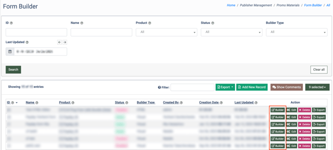
To create the JS Form for further customization via the HTML editor, go to the **Publisher Management \> Promo Materials \> Form Builder** section.
[](https://support.phonexa.com/hubfs/E8xdg24Xbd.png?hsLang=en)
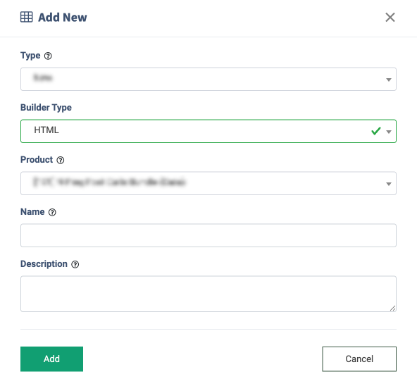
Click the **“Add New Record”** button and select the **“HTML”** option in the **“Builder Type”** field. Fill in the rest of the fields in the **“Add New”** pop-up window and click the **“Add”** button to complete the action.
[](https://support.phonexa.com/hubfs/zoQywXMBxA.png?hsLang=en)
After the form creation, click the **“Builder”** button in the confirmation pop-up window, or select the newly created form from the list and click the **“Builder”** button in the **“Action”** column.
You will be redirected to the Form Builder section, where you can customize and manage the JS form.
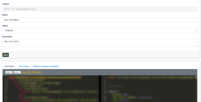
The top block contains general information about the form, and you can manage the following settings:
- **Product:** The name of the Product with which the form is associated. *Note: This field can not be changed.*
- **Name:** Enter the name of the JS form.
- **Status:** Select the current status of the JS form *(Disabled, Active, Deleted).*
- **Description:** Enter the description for the JS form.
Click the **“Save”** button to complete the changes.
[](https://support.phonexa.com/hubfs/vJxjRe9exE.png?hsLang=en)
The block with the edition settings contains the following tabs:
- [**HTML Editor**](https://support.phonexa.com/form-builder-html-editor#HTML_Editor)
- [**Form Fields**](https://support.phonexa.com/form-builder-html-editor#Form_Fields)
- [**Response Analyzer & Redirect**](https://support.phonexa.com/form-builder-html-editor#Response_Analyzer_Redirect)
### HTML Editor
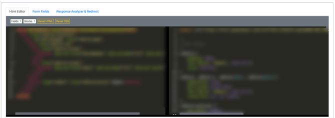
The **“HTML Editor”** tab allows you to customize the form with the HTML code.
The HTML code for the page is displayed in the left block, and the CSS code is displayed in the right block.
[](https://support.phonexa.com/hubfs/mKbPyXejxO1.png?hsLang=en)
To add the fields to the form, click the **“Fields”** menu and select the option from the drop-down list. *Note: The list of available fields depends on the Product that is associated with the JS Form.*
The newly added field will appear in the left HTML Editor block.
To add the code of the block from the template, click the **“Blocks”** menu and select the option from the drop-down list. The following options are available: *Form, Container, Form Page, Row, Column, Submit Button, Next Page Button, Prev Page Button.*
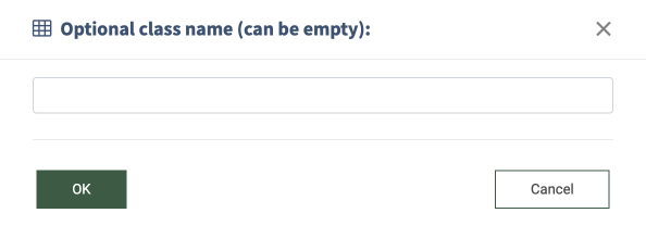
Enter the name of the \ class for the block in the **“Options class name (can be empty)”** pop-up window and click the **“OK”** button to apply the naming.
[](https://support.phonexa.com/hubfs/jNbvvWEybW.png?hsLang=en)
The newly added block will appear in the left HTML Editor block.
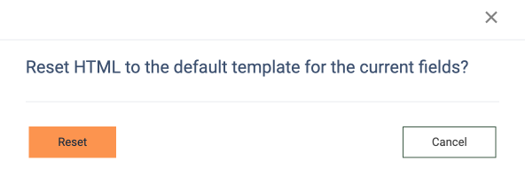
To reset the HTML code to the default template code for the Product, click the **“Reset HTML”** button. Confirm the reset operation by clicking the **“Reset”** button in the pop-up window below.
[](https://support.phonexa.com/hubfs/p9Q2jD0BQ5.png?hsLang=en)
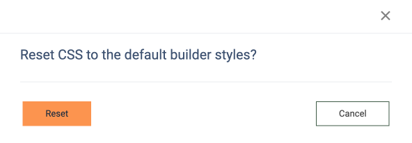
To reset the CSS code to the default template code, click the **“Reset CSS”** button. Confirm the reset operation by clicking the **“Reset”** button in the pop-up window below.
[](https://support.phonexa.com/hubfs/BnbpEOLXxz.png?hsLang=en)
Tabs below the HTML Editor contain the preview options for the form on the different steps of its processing. The following options are available:
- [**Preview Form**](https://support.phonexa.com/form-builder-html-editor#Preview_Form)
- [**Preview Search**](https://support.phonexa.com/form-builder-html-editor#Preview_Search)
- [**Preview Thank You**](https://support.phonexa.com/form-builder-html-editor#Preview_Thank_You)
- [**Preview Consent**](https://support.phonexa.com/form-builder-html-editor#Preview_Consent)
#### Preview Form
The **“Preview Form”** tab allows you to view the preview of the form's appearance. You can view all available fields, the form structure, buttons, and validation messages for the input values.
[](https://support.phonexa.com/hubfs/XaboAMK4rp.png?hsLang=en)
To view the validation messages for the input fields, click the **“Show Validation”** button in the widget placed at the top right corner of the block. To hide or view the widget with the button, click the arrow button on the widget.
[](https://support.phonexa.com/hubfs/q8x3Lyw5ra.png?hsLang=en)The validation message will appear below the input fields.
[](https://support.phonexa.com/hubfs/LDrG7OJdrB.png?hsLang=en)
#### Preview Search
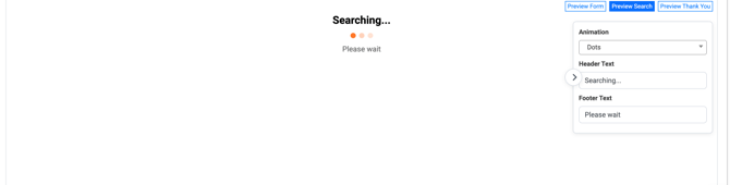
The **“Preview Search”** tab allows you to view and customize the page that will appear to the user while searching for matches with buyers.
The following settings are available:
- **Animation:** Select the searching animation that will be applied to the search form *(Dots, Spinner, Bar).*
- **Header Text:** Enter the text that will be displayed in the header above the search animation.
- **Footer Text:** Enter the text that will be displayed below the search animation.
[](https://support.phonexa.com/hubfs/jNbvvWEgbW.png?hsLang=en)
#### Preview Thank You
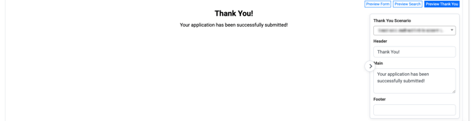
The **“Preview Thank You”** tab allows you to view and customize the page (the Thank You page) that will appear to the user during the scenarios when the lead is successfully sold or when the application is rejected.
The following settings are available:
- **Thank You Scenario:** Select the scenario when the Thank You page will appear *(Lead sold, redirect link is present in the response; Lead sold, redirect link is absent in the response; Lead rejected, redirect link is present in the response; Lead rejected, redirect link is absent in the response). Note: The list of options depends on the settings and selected options set in the* ***“Response Analyzer and Redirect”*** *tab.*
- **Header:** Enter the text for the form header that will be displayed at the top of the page.
- **Main:** Enter the text that will be displayed in the main section of the form.
- **Footer:** Enter the text that will be displayed in the footer section of the page.
[](https://support.phonexa.com/hubfs/p9Q2jD0pQ5.png?hsLang=en)
#### Preview Consent
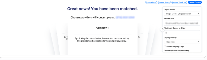
The **“Preview Consent”** tab allows you to view and customize the page (the Consent page) that will appear to the user during the scenarios when the lead receives offers from a couple of companies (Buyers), and the client (lead) needs to select the most appropriate one and sign the consent agreement for the personal data being sent to the selected company (Buyer).
The Consent page will allow your users to carefully review the Buyer's conditions as they fill out the form, ensuring compliance with the FCC 1:1 consent regulations
*Note: This option is available only for Products with the* ***“Smart Legs”*** *posting type.*
*Read more about the Ping-Post Products and Smart Legs integration in the following Knowledge Base* [*article*](https://support.phonexa.com/ping-post-products-regular-and-smart#Smart_Tree_Ping_Post_Product_V_2)*.*
The following settings are available:
- **Layout Mode:** Select the layout mode for the consent page *(Swipe Mode - Unique Consent, Generic Consent Mode).* The *“Swipe Mode - Unique Consent”* option allows the lead to view the offers from the companies one by one, individually, in a slide or carousel format, giving explicit consent to each offer separately. The *“Generic Consent Mode”* option allows the lead to view offers all at once in the form of a list and select one or more offers to consent to simultaneously.
- **Header Text:** Enter the text for the form header that will be displayed at the top of the page.
- **Maximum Buyers to Show:** Enter the limitation for the maximum number of offers that were received from the different companies (Buyers).
- **Display Priority:** Select the prioritisation approach for the offers display order *(Max Price, Campaign Priority).*
- **Show Company Logo:** Check the box to display the company logo on the form.
- **Company Name Response Key:** Select the key field (attribute) from which the name of the company should be retrieved for displaying*.*
- **Consent Language Response Key:** Select the key field (attribute) from which the consent language or legal text should be retrieved for displaying*.*
- **Logo URL Response Key:** Select the key field (attribute) from which the logo image (the image URL) should be retrieved for displaying.
*Note: The key fields (attributes) for the “****Company Name Response Key”, “Consent Language Response Key”,*** *and* ***“Logo URL Response Key”*** *are set in the* ***“Product Additional Attributes”*** *subtab of the* ***“Additional Response Field”*** *tab of the* ***“Product Setup”*** *section for the application on the Product level.*
*Note: The key fields (attributes) for the “****Company Name Response Key”, “Consent Language Response Key”,*** *and* ***“Logo URL Response Key”*** *are set in the* ***“Campaign Additional Attributes”*** *tab of the* ***“Campaign Setup”*** *section for the application on the Campaign Settings level.*
*Read more about the* [*Additional Response Fields*](https://support.phonexa.com/product-setup-additional-response-fields?hsLang=en) *and* [*Campaign Additional Attributes*](https://support.phonexa.com/campaign-configuration-campaign-additional-attributes?hsLang=en) *in the Knowledge Base articles.*
- **Phone Number Text:** Enter the text that will be displayed in the row with the phone number of the lead.
- **Phone Number Field Name:** Select the fields from which the phone number of the lead should be retrieved.
- **Show Email Address:** Check the box to display the settings for the display of the email address of the lead. If the option is checked, the following settings are available:
- **Email Text:** Enter the text that will be displayed in the row with the email address of the lead.
- **Email Field Name:** Select the fields from which the email address of the lead should be retrieved.
- **Submit Button Text:** Enter the label for the submit button.
- If the **“Swipe Mode - Unique Consent”** option is selected in the **“Layout Mode”** field:
- **Agree Button Text:** Enter the label for the button of the agreement for sending the personal data to the company (Buyer). This text will be displayed before the lead confirms the consent agreement.
- **Agreed Button Text:** Enter the label for the button of the agreement for sending the personal data to the company (Buyer). This text will be displayed when the lead accepts the consent agreement.
- **Chosen Providers Text:** Enter the label for the cart where the companies that provided offers are displayed. *Note: This field is available only when the* ***“Swipe Mode - Unique Consent”*** *option is selected in the “****Layout Mode”*** *field.*
- **Auto Show Next Unchecked:** Check the box to automatically navigate to the next offer card after the user clicks the Agree button. The setting controls whether clicking the button labeled in the **“Agree Button Text”** field will automatically move the user to the next offer card.
- If the ***“Generic Consent Mode”*** option is selected in the **“Layout Mode”** field:
- **Allow Select All Buyers:** Check the box to allow the selection of all Buyers that were provided with the offer by displaying the corresponding button.
- **Select All Buyers Text:** Enter the text that will be displayed on the button for selection of all Buyers that were provided with the offer.
- **Consent Text:** Enter the text of the consent agreement. This text will be displayed before the option to sign the agreement that will be displayed for the lead.
[](https://support.phonexa.com/hubfs/JPbRdzkarw.png?hsLang=en)
### Form Fields
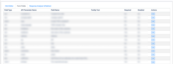
The **“Form Fields”** tab allows you to manage and customize the settings for fields that appear on the JS form. The list of available fields contains fields that are available for the Product associated with the form.
The list of available fields contains the following information:
- **Field Type:** The type of the field *(Text, Email, Number, Tel, Date, Hidden, Url, Select, Slider, Checkbox, Radio, DobGroup, TermsGroup, PushButtons).*
- **API Parameter Name:** The name of the API field that corresponds to the form field.
- **Field Name:** The name of the field that is displayed on the form.
- **Tooltip Text:** The text for the tooltip that is displayed on the form.
- **Required:** The requiredness of the field for the user input *(Yes, No).*
- **Disabled:** The disability of the field for the user input *(Yes, No).*
[](https://support.phonexa.com/hubfs/p9Q2j12YQ5.png?hsLang=en)
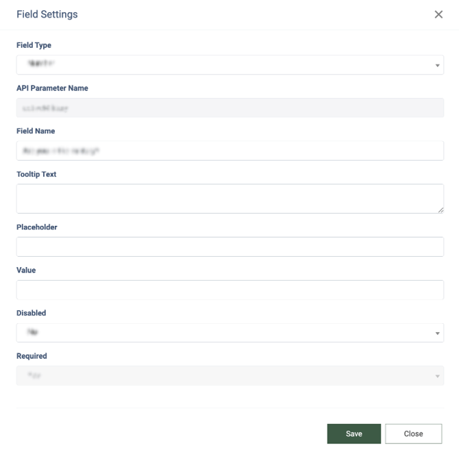
To configure the field, select one from the list and click the **“Edit”** button in the **“Actions”** column. Change the information in the following fields of the **“Field Settings”** pop-up window:
- **Field Type:** Select the type of the field *(Text, Email, Number, Tel, Date, Hidden, Url, Select, Slider, Checkbox, Radio, DobGroup, TermsGroup, PushButtons).*
- **API Parameter Name:** The name of the API field that corresponds to the form field. *Note: This value can not be changed.*
- **Field Name:** Enter the name of the field that is displayed on the form.
- **Tooltip Text:** Enter the text for the tooltip that is displayed on the form. This text will be placed in the tooltip widget next to the name of the form field and displayed to the client while clicking the tooltip widget with the question mark.
- **Placeholder:** Enter the placeholder for the field. The placeholder represents the hint text displayed inside the field input before user entry. *Example of usage:* For the field with the date input type, the date should be entered in the *“MM/DD/YYYY”* format. The user can enter the hint text into this field to guide the user with the appropriate format to ensure the proper data format for input.
- **Value:** Enter the value that should be applied for this field by default.
- **Mask:** Enter the input format for the field (mask). The mask represents the rule applied to input values in a defined format (e.g., phone number (000)-000-000, date 00/00/0000, etc.). The following symbols are allowed for use: (), /, -, +. The alphanumeric characters are allowed for use. This format will be used for the field input as a strict standard and will transform the entered value into the set mask format. Also, the mask will filter out all input symbols and restrict their entry according to the type of the field, set in the **“Field Type”** field. For example, the user enters the phone number as follows: +15176336438 or 15176336438. The mask format for the field is set as follows: +1(000)000-00-00. In this case, the user input will be transformed into the following format automatically according to the set mask: +1(517)633-64-38.
- **Date Region:** Select the region that determines the approach for the data input *(Default, US, UK).* *Note: This option is available only for the “Date” field type option.*
- **Disabled:** Select the disability of the field for the user input (Yes, No).
- **Required:** The requiredness of the field for the user input *(Yes, No). Note: This value can not be changed.*
Click the **“Save”** button to apply the field settings.
[](https://support.phonexa.com/hubfs/LGbV2wkoby.png?hsLang=en)
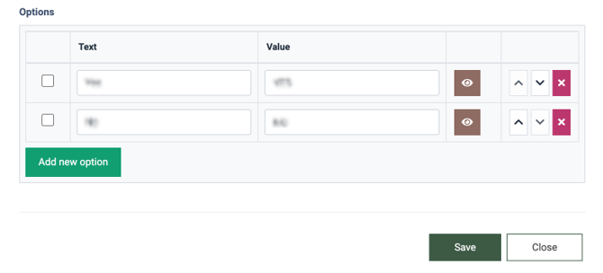
For the following field types: *Select, Checkbox, Radio, PushButtons,* the **“Options”** block is available in the **“Field Settings”** pop-up window. This block allows you to set the text for the option and the value that will be selected in case the user selects this option in the **“Text”** and **“Value”** fields, respectively, set the visibility and disability option by clicking the eye button, arrange the order of the options in the list by clicking the arrow up and arrow down buttons, and remove the option from the list by clicking the red cross button. To add a new option to the list, click the **“Add new option”** button.
[](https://support.phonexa.com/hubfs/XGbO0EWOxq.png?hsLang=en)
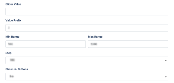
For the **“Slider”** option selected in the “**Field Type”** field, the following settings are available:
- **Slider Value:** Enter the default values that will be set for the slider field.
- **Value Prefix:** Enter the prefix that represents the measurement for the slider value.
- **Min Range:** Enter the minimum value that can be set on the slider.
- **Max Range:** Enter the maximum range that can be set on the slider.
- **Step:** Select the value step for one slide on the slider *(100, 200, 500, 1000, 10000, 50000).*
- **Show +/- Buttons:** Select the option for displaying the button for adding or removing one step on the slider.
[](https://support.phonexa.com/hubfs/oEQLBRnvxJ.png?hsLang=en)
### Response Analyzer & Redirect
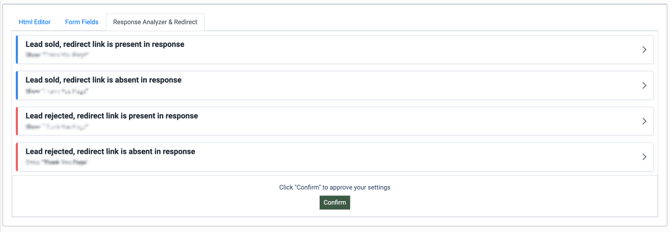
The **“Response Analyzer & Redirect”** tab allows you to manage and customize the form and system behavior depending on the outcomes of the lead processing through the form.
The settings are split into blocks depending on the lead processing outcomes:
- **Lead sold, redirect link is present in the response:** The lead was sold, and the response from the system contains the redirect link.
- **Lead sold, redirect link is absent in the response:** The lead was sold, but the redirect link is absent in the response from the system.
- **Lead rejected, redirect link is present in the response:** The lead was processed through the system and was rejected, and the response from the system contains the redirect link.
- **Lead rejected, redirect link is absent in the response:** The lead was processed through the system and was rejected, and the response from the system does not contain the redirect link.
[](https://support.phonexa.com/hubfs/5ArWNY00x9.png?hsLang=en)
Each block contains the setting that allows you to manage the action that should be taken after the lead processing through the system for every outcome.
Click the arrow button in the outcome block, expand the collapsible section, and select the option in the **“Action”** field:
- **Use status redirect url:** Redirects the lead to the predefined status redirect URL.
- **Static URL:** Enter the redirect URL to which the lead should be redirected.
- **Use redirect url from response:** Redirects the lead to the URL that is obtained from the system response.
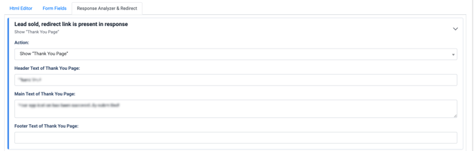
- **Show “Thank You” page:** Redirects the lead to the customized Thank You page. The following settings are available:
- **Header Text of Thank You Page:** Enter the text for the form header that will be displayed at the top of the page.
- **Main Text of Thank You Page:** Enter the text for the main form section that will be displayed in the center middle section of the page.
- **Footer Text of Thank You Page:** Enter the text for the footer form section that will be displayed at the bottom of the page.
Click the **“Confirm”** button to apply the response analyzer and redirect settings.
[](https://support.phonexa.com/hubfs/W7rXBqwObK.png?hsLang=en)
[](https://support.phonexa.com/hubfs/Epr7J9G9xX.png?hsLang=en)
[](https://support.phonexa.com/hubfs/ezrzVAdjrj.png?hsLang=en)
- [General information](https://support.phonexa.com/general-information?hsLang=en#main-content)
- [Account Settings](https://support.phonexa.com/general-information?hsLang=en#account-settings)
- [Security Settings](https://support.phonexa.com/general-information?hsLang=en#security-settings)
- [Users](https://support.phonexa.com/general-information?hsLang=en#users)
- [System Customization](https://support.phonexa.com/general-information?hsLang=en#system-customization)
- [Project Customization](https://support.phonexa.com/general-information?hsLang=en#project-customization)
- [Product Customization](https://support.phonexa.com/general-information?hsLang=en#product-customization)
- [System Management](https://support.phonexa.com/general-information?hsLang=en#system-management)
- [Support](https://support.phonexa.com/general-information?hsLang=en#support)
- [LMS Sync & Call Logic](https://support.phonexa.com/lms-sync-call-logic?hsLang=en#main-content)
- [Extra Features](https://support.phonexa.com/lms-sync-call-logic?hsLang=en#extra-features)
- [Publisher Configuration](https://support.phonexa.com/lms-sync-call-logic?hsLang=en#publisher-configuration)
- [Client Management](https://support.phonexa.com/lms-sync-call-logic?hsLang=en#client-management)
- [System Logs](https://support.phonexa.com/lms-sync-call-logic?hsLang=en#system-logs)
- [Documents And References](https://support.phonexa.com/lms-sync-call-logic?hsLang=en#documents-and-references)
- [Reports and Analytics](https://support.phonexa.com/lms-sync-call-logic?hsLang=en#reports-and-analytics)
- [Publisher management](https://support.phonexa.com/lms-sync-call-logic?hsLang=en#publisher-management)
- [Call Logic Customization](https://support.phonexa.com/lms-sync-call-logic?hsLang=en#call-logic-customization)
- [Campaign Configuration](https://support.phonexa.com/lms-sync-call-logic?hsLang=en#campaign-configuration)
- [Feed CMS](https://support.phonexa.com/lms-sync-call-logic?hsLang=en#feed-cms)
- [Event Tracking](https://support.phonexa.com/lms-sync-call-logic?hsLang=en#event-tracking)
- [iClear](https://support.phonexa.com/lms-sync-call-logic?hsLang=en#iclear)
- [E-Delivery](https://support.phonexa.com/e-delivery?hsLang=en#main-content)
- [List Management](https://support.phonexa.com/e-delivery?hsLang=en#list-management)
- [Email Campaigns](https://support.phonexa.com/e-delivery?hsLang=en#email-campaigns)
- [SMS Campaigns](https://support.phonexa.com/e-delivery?hsLang=en#sms-campaigns)
- [Reports](https://support.phonexa.com/e-delivery?hsLang=en#reports)
- [Suppression Management](https://support.phonexa.com/e-delivery?hsLang=en#suppression-management)
- [Books360](https://support.phonexa.com/books360?hsLang=en#main-content)
- [Books 360 Integration](https://support.phonexa.com/books360?hsLang=en#books-360-integration)
- [Vendor Management](https://support.phonexa.com/books360?hsLang=en#vendor-management)
- [Account](https://support.phonexa.com/books360?hsLang=en#account)
- [Customer Management](https://support.phonexa.com/books360?hsLang=en#customer-management)
- [Opt-Intel](https://support.phonexa.com/opt-intel?hsLang=en#main-content)
- [List Management](https://support.phonexa.com/opt-intel?hsLang=en#list-management)
- [All Reports](https://support.phonexa.com/opt-intel?hsLang=en#all-reports)
- [Mailers](https://support.phonexa.com/opt-intel?hsLang=en#mailers)
- [Campaigns](https://support.phonexa.com/opt-intel?hsLang=en#campaigns)
- [System Management](https://support.phonexa.com/opt-intel?hsLang=en#system-management)
- [HitMetrix](https://support.phonexa.com/hitmetrix?hsLang=en#main-content)
- [Analytics](https://support.phonexa.com/hitmetrix?hsLang=en#analytics)
- [Heatmaps](https://support.phonexa.com/hitmetrix?hsLang=en#heatmaps)
- [System Management](https://support.phonexa.com/hitmetrix?hsLang=en#system-management)
- [Lynx](https://support.phonexa.com/lynx?hsLang=en#main-content)
- [Offers](https://support.phonexa.com/lynx?hsLang=en#offers)
- [LYNX Reports](https://support.phonexa.com/lynx?hsLang=en#lynx-reports)
- [Advertisers](https://support.phonexa.com/lynx?hsLang=en#advertisers)
- [Affiliates](https://support.phonexa.com/lynx?hsLang=en#affiliates)
- [Account Settings](https://support.phonexa.com/lynx?hsLang=en#account-settings)
- [Cloud PBX](https://support.phonexa.com/cloud-pbx?hsLang=en)
[](https://phonexa.com/?hsLang=en)
Phonexa Knowledge Base
Copyright © 2026, Phonexa