Note: The set of charts may differ depending on the selected product. This is determined by the fact that each product has its own requirements for lead parameters.
To view the report, go to the Analytics And Optimization > Deep Аnalytics > Waves section.
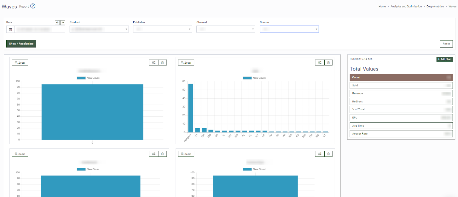
On the left side of the report, the “Total Values” table displays data on all leads for the selected period and specific product:
-
Counts: The number of sent leads.
-
Sold: The number of sold leads.
-
Revenue: The revenue for a certain product in a certain period.
-
% of Total: The ratio of the sold leads to the total amount of incoming leads.
-
EPL: Earnings per lead.
-
Avg Time: The average time of lead sale.
-
Accept Rate: The ratio of the sold leads to the total amount of sent leads.
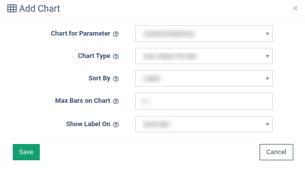
To add a new chart, click the “+ Add Chart” button and fill in the following fields in the pop-up window:
-
Chart of Parameter: Select the parameter name to build the chart.
-
Chart Type: Select the chart type (One Value Per Bar - each value has its own bar, Range of Numeric Values Per Bar - for numeric parameters only, show one bar for a range of values).
-
Sort By: Select the sorting method (Label or Hight).
-
Max Bars on Chart: Select the number of bars on the chart.
-
Show Label On: Select the “Each Bar” or “Auto-Optimize” option.
Note: If too many bars are displayed on this chart, try using Auto-Optimize to avoid overlapping labels.
You can narrow down the search results by using the following filters:
-
Date: Select the date range.
-
Product: Select the product.
-
Publisher: Select the publisher.
-
Channel: Select the channel.
-
Source: Select the source.