To view the section, go to the Publisher Management > Promo Materials > Form Builder section, click the "Builder" button, and select the "Form Customization and Preview" tab.
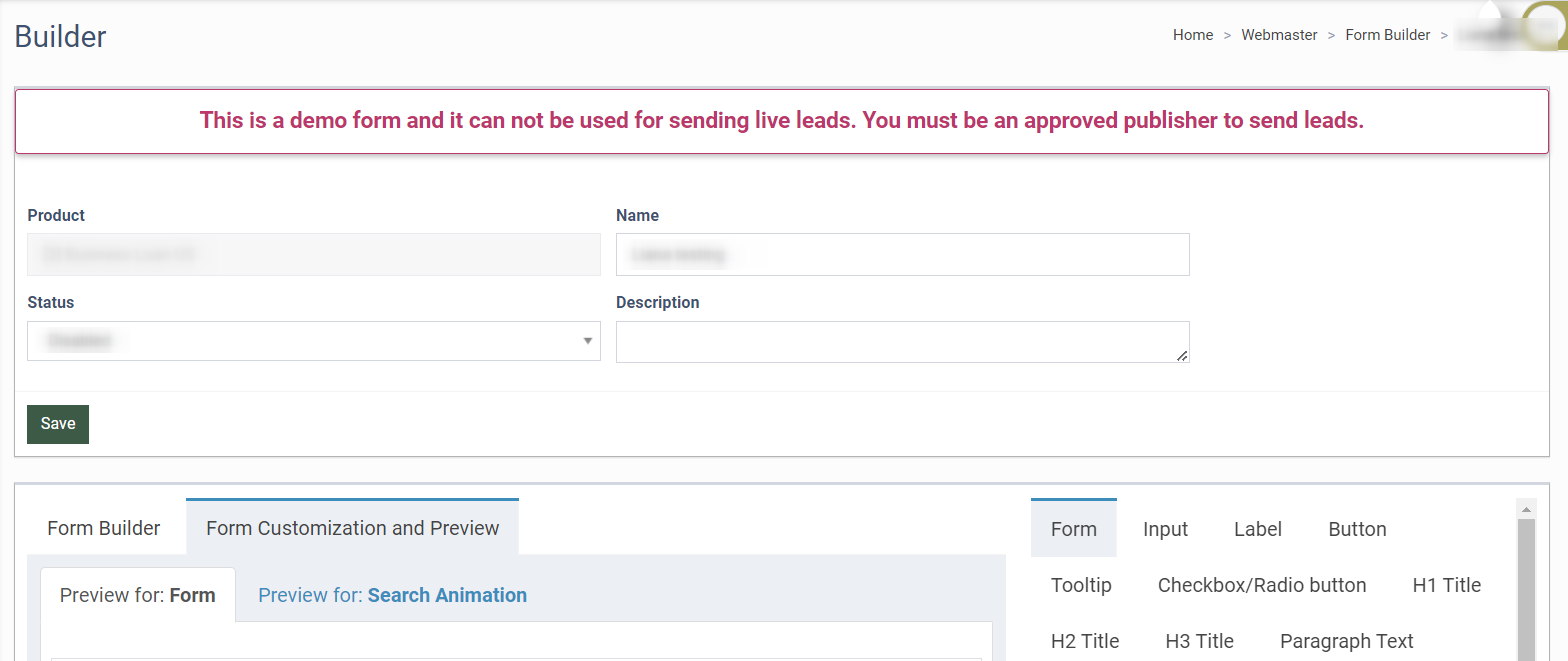
The “Form Customization and Preview” section displays the final appearance of the form. All changes made in the “Form Builder” tab will be displayed in the “Form Customization and Preview” tab after saving.
If you use the multi-page forms (two or more pages), the system will automatically display the additional “Progress Bar” block. This block displays the progress of the form-filling process.
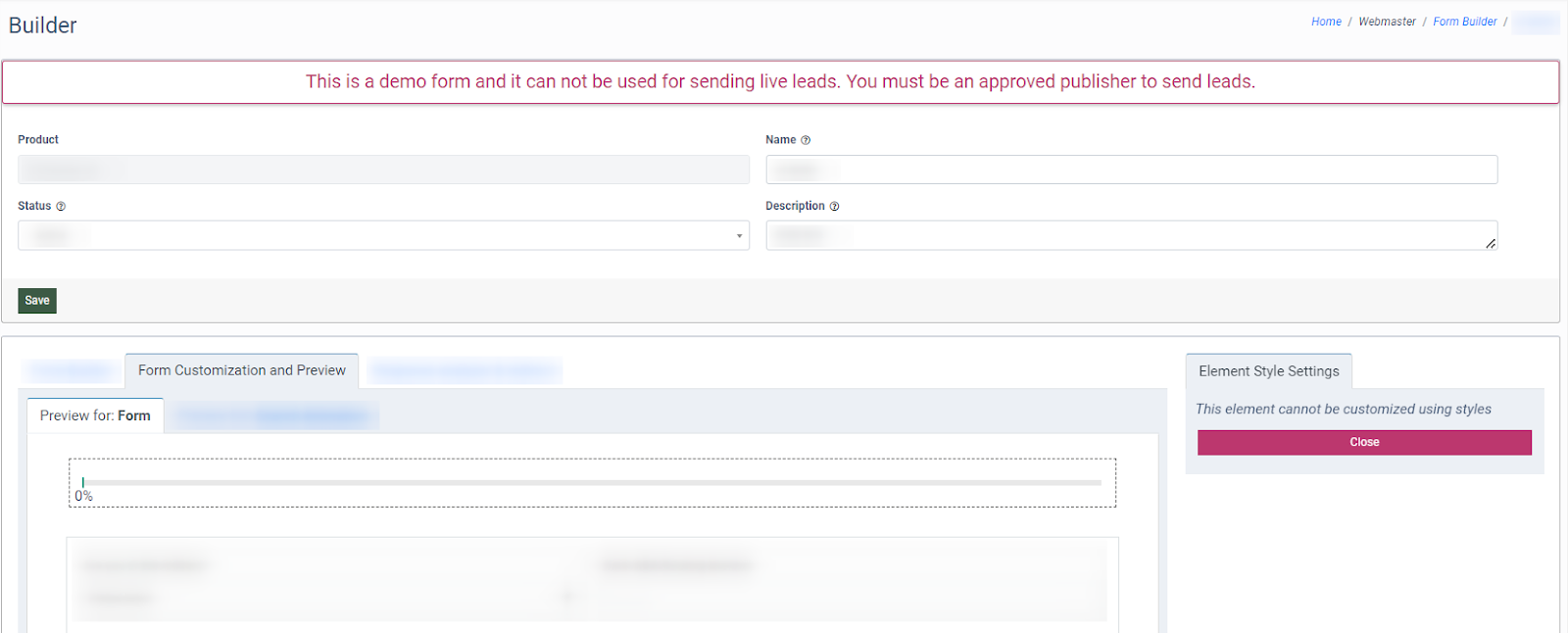
Note: To set up the “Progress Bar” block, go to the “Form Builder” tab. Read more about the Form Builder tab in this Knowledge Base article.
Themes
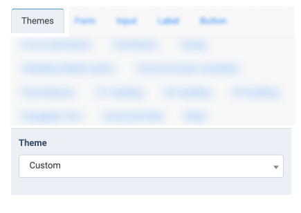
- Theme: Select the theme for the form fields' borders and style (Classic, Rounded, Custom).
Form
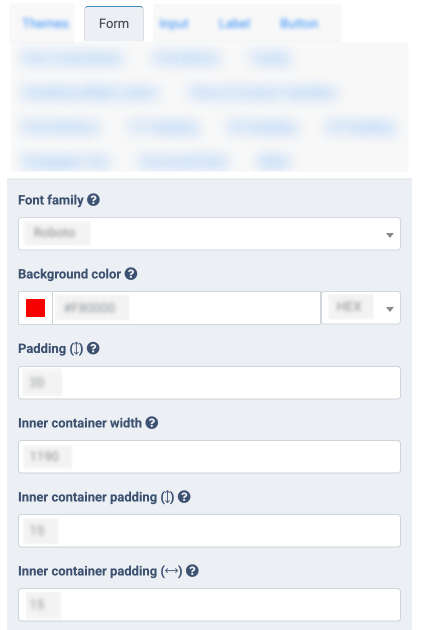
- Font Family: Select the text font.
- Background color: Select the background color of the form.
- Padding: Select the value of the padding for the form.
- Inner container width: Select the value for the inner container width.
- Inner container padding: Select the value of the inner container padding for vertical padding.
- Inner container padding: Select the value of the inner container padding for horizontal padding.
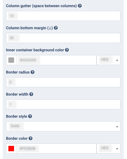
- Column gutter (space between columns): Select the value to set the space between columns.
- Column bottom margin: Select the value to set the margin at the bottom of the form.
- Inner container background color: Select the inner color of the form.
- Border radius: Select a value for the maximum or minimum goal range.
- Border width: Select the value for border width.
- Border style: Select the style for the form’s border (None, Active, Dashed). It is disabled by default.
- Border color: Select the color for the form.
Input
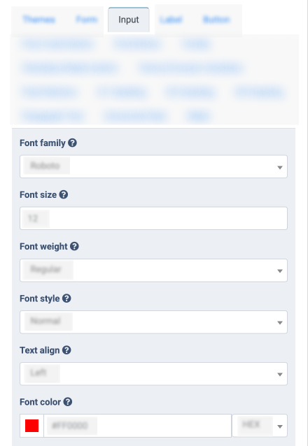
- Font family: Select the text font.
- Font size: Select the text size.
- Font weight: Select the weight of text (Light, Bold, Regular). It is disabled by default.
- Font style: Select the text style (Normal, Italic). It is disabled by default.
- Text align: Select the text location in the field from the drop-down list (Left, Center, Right).
- Font color: Select the color of the text.
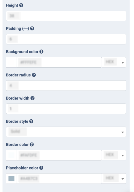
- Height: Select the height of the form.
- Padding: Select the horizontal padding for the text in the field.
- Background color: Select the color for the form’s fields.
- Border radius: Select the border radius for the form’s fields.
- Border width: Select the border width for the form’s fields.
- Border style: Select the style field (None, Solid, Dashed).
- Border color: Select the color for the field’s border.
- Placeholder color: Select the placeholder color for the input fields.
Label
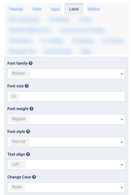
- Font family: Select the text font.
- Font size: Select the text size for the field’s title.
- Font weight: Select the text weight (Regular, Bold, Light).
- Font style: Select the style (Normal, Italic) for the field’s title.
- Text align: Select the text position above the field(Left, Center, Right).
- Change Case: Select the change case (None, Uppercase, Lowercase).
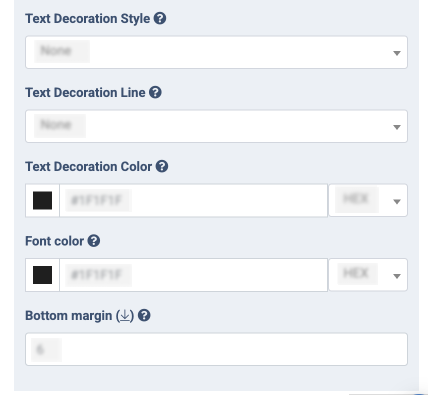
- Text Decoration Style: Select the text decoration style (None, Solid, Dashed, Dotted, Double, Wavy).
- Text Decoration Line: Select the text decoration style (None, Underline, Overline, Line Through).
- Text Decoration Color: Select the color of the text decoration line.
- Font color: Select the color for the field’s title.
- Bottom margin: Select the value to set the margin at the bottom of the label.
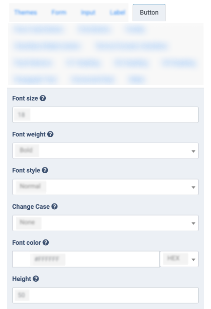
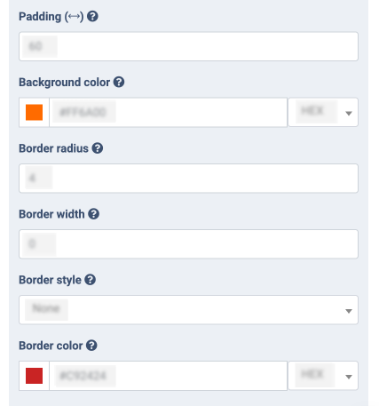
Button

-
Font size: Select the text size.
-
Font weight: Select the text weight (Regular, Bold, Light).
-
Font style: Select the font style for the text (Normal, Italic).
-
Change Case: Select the text-transform (None, Uppercase, Lowercase).
-
Font color: Select the button’s text color.
-
Height: Select the button height.
-
Padding: Select the button width.
-
Background color: Select the button’s color.
-
Border radius: Select the button’s radius.
-
Border width: Select the border width.
-
Border style: Select the border style (None, Solid, Dashed).
-
Border color: Select the border color.
Post Code Button
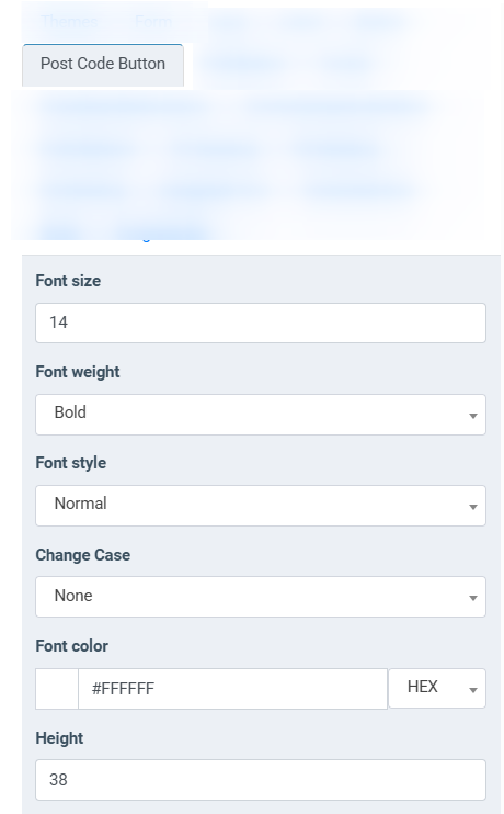
- Font size: Select the text size.
- Font weight: Select the text weight (Regular, Bold, Light).
- Font style: Select font style for the text (Normal, Italic).
- Change Case: Select the text-transform (None, Uppercase, Lowercase).
- Font color: Select the button’s text color.
- Height: Select the button height.
- Padding: Select the button width.
- Background color: Select the button’s color.
- Border radius: Select the button’s radius.
- Border width: Select the border width.
- Border style: Select the border style (None, Solid, Dashed).
- Border color: Select the border color.
Find Button
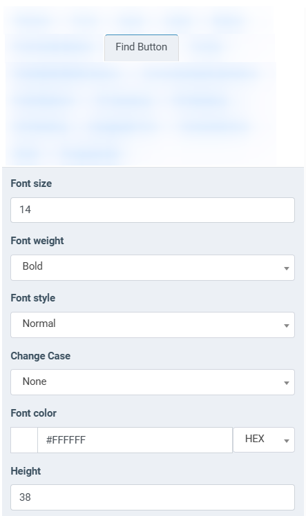
- Font size: Select the text size.
- Font weight: Select the text weight (Regular, Bold, Light).
- Font style: Select font style for the text (Normal, Italic).
- Change Case: Select the text-transform (None, Uppercase, Lowercase).
- Font color: Select the button’s text color.
- Height: Select the button height.
- Padding: Select the button width.
- Background color: Select the button’s color.
- Border radius: Select the button’s radius.
- Border width: Select the border width.
- Border style: Select the border style (None, Solid, Dashed).
- Border color: Select the border color.
Tooltip
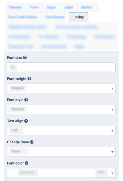
- Font size: Select the text size.
-
Font weight: Select the text weight (Regular, Bold, Light).
-
Font style: Select the style (Normal, Italic).
-
Text align: Select the position for the tooltip text (Left, Center, Right).
-
Change Case: Select the text-transform (None, Uppercase, Lowercase).
-
Font color: Select the text color.
-
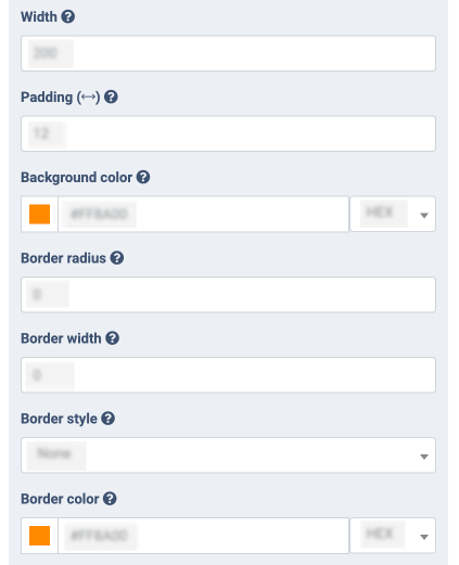
Width: Select the tooltip width.
-
Padding: Select the inner indents.
-
Background color: Select the tooltip background color.
-
Border radius: Select the border radius of the tooltip.
-
Border width: Select the border width.
-
Border style: Select the border style (None, Solid, Dashed).
-
Border color: Select the border color.
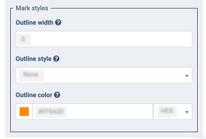
- Outline width: Enter the outline width.
- Outline style: Select the outline style (None, Solid, Dashed).
- Outline color: Select the outline color.
Checkbox/Radio button
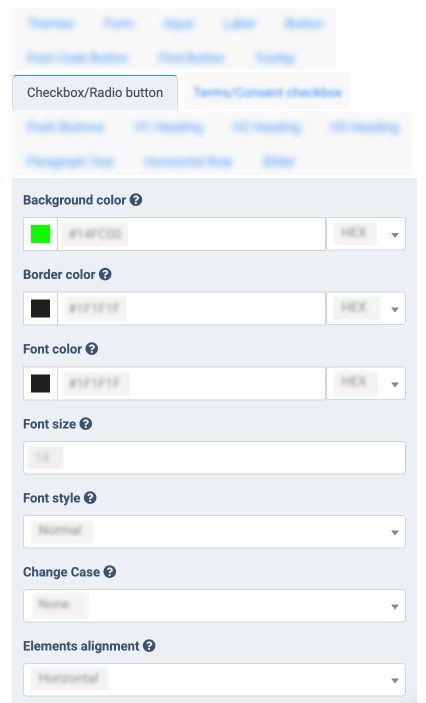
- Background color: Select the background color.
- Border color: Select the border color.
- Font color: Select the text color.
- Font size: Select the font size.
- Font style: Select the font style (Normal, Italic).
- Change Case: Select the text-transform (Lowercase, Uppercase, None).
- Elements alignment: Select the value to set the alignment of the checkboxes/radio buttons (Horizontal, Vertical).
Terms/Consent checkbox
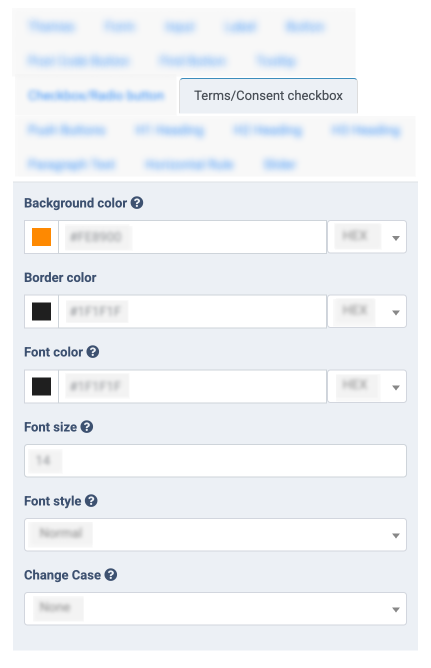
- Background color: Select the background color of the checked state.
- Border color: Select the border color.
- Font color: Select the font color.
- Font size: Select the font size.
- Font style: Select the font style (Normal, Italic).
- Change Case: Select the text-transform (Lowercase, Uppercase, None).
Push buttons
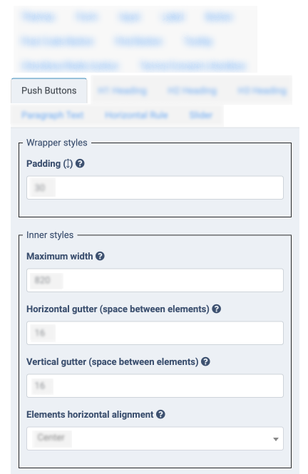
- Padding: Select the inner vertical indents.
- Maximum width: Enter the maximum width of the Push Buttons container (set 0 for 100% width of the outer container).
- Horizontal gutter (space between elements): Enter the horizontal gutter between buttons.
- Vertical gutter (space between elements): Enter the vertical gutter between buttons.
- Elements horizontal alignment: Select the value to set the alignment of buttons (Center, Left, Right).
- Bottom margin: Select the value of the margin at the bottom of the title.
- Text align: Select the text location (Left, Center, Right).
- Font size: Select the font size.
- Font weight: Select the weight of the text (Regular, Bold, Light). It is disabled by default.
- Font style: Select the font style for the text (Normal, Italic).
- Change Case: Select the font transformer (None, Lowercase, Uppercase).
- Font color: Select the color of the text.
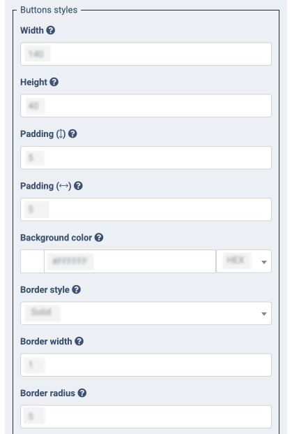
- Width: Enter the width of the button (set the “0” value to apply the auto-width option).
- Height: Enter the height of the button (set the “0” value to apply the auto-height option).
- Padding: Select the inner vertical indents.
- Padding: Select the inner horizontal indents.
- Background color: Select the background color of the button.
- Border style: Select the border style (None, Solid, Dashed, Dotted, Double, Groove).
- Border width: Enter the border width for the button.
- Border radius: Enter the border radius for the button.
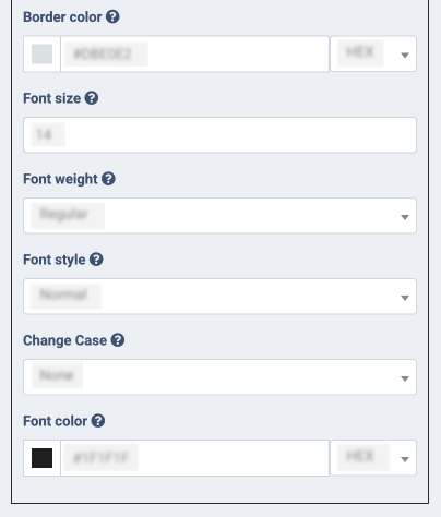
- Border color: Select the border color.
- Font size: Select the font size.
- Font weight: Select the weight of the text (Regular, Bold, Light). It is disabled by default.
- Font style: Select the font style for the text (Normal, Italic).
- Change Case: Select the font transformer (None, Lowercase, Uppercase).
- Font color: Select the color of the text.
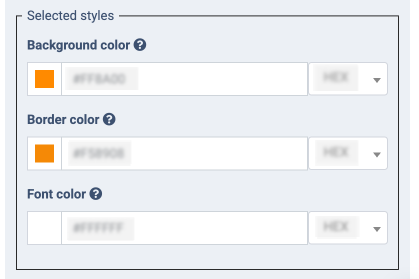
- Background color: Select the background color of the button.
- Border color: Select the border color.
- Font color: Select the color of the text.
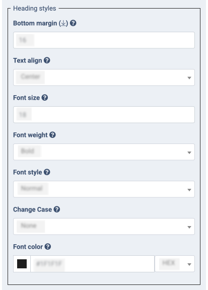
H1/H2/H3 Heading
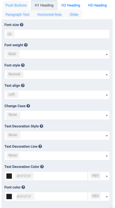
- Font size: Select the text size.
- Font weight: Select the weight of text (Light, Bold, Regular). It is disabled by default.
- Font style: Select font style for the text (Normal, Italic).
- Text align: Select the text location from the drop-down list (Left, Center, Right).
- Change Case: Select the change case (None, Uppercase, Lowercase).
- Text Decoration Style: Select the text style (None, Solid, Dashed, Dotted, Double, Wavy).
- Text Decoration Line: Select the text decoration style (None, Underline, Overline, Line Through).
- Text Decoration Color: Select the text decoration color.
- Font color: Select the color of the text.
Paragraph Text
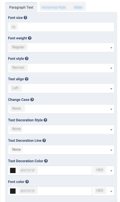
- Font size: Select the text size.
- Font weight: Select the weight of text (Light, Bold, Regular). It is disabled by default.
- Font style: Select the font style for the text (Normal, Italic).
- Text align: Select the text location from the drop-down list (Left, Center, Right).
- Change Case: Select the change case (None, Uppercase, Lowercase).
- Text Decoration Style: Select the text style (None, Solid, Dashed, Dotted, Double, Wavy).
- Text Decoration Line: Select the text decoration style (None, Underline, Overline, Line Through).
- Text Decoration Color: Select the text decoration color.
- Font color: Select the color of the text.
Horizontal Rule
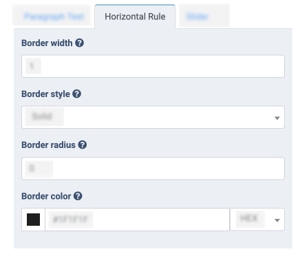
- Border width: Choose the border width for the horizontal rule.
- Border style: Select the border style (None, Solid, Dashed).
- Border radius: Enter the border radius for the horizontal rule.
- Border color: Choose the border color from the palette.
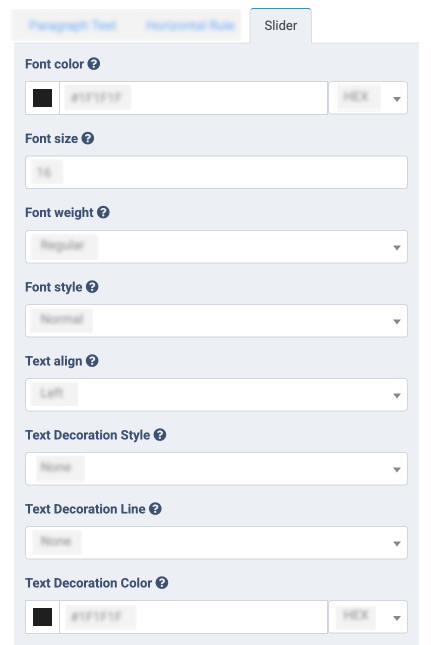
Slider
-
Font color: Select the color of the text.
-
Font size: Select the text size.
-
Font weight: Select the weight of text (Light, Bold, Regular). It is disabled by default.
-
Font style: Select font style for the text (Normal, Italic).
-
Text align: Select the text location (Left, Center, Right).
-
Text Decoration Style: Select the text style (None, Solid, Dashed, Dotted, Double, Wavy).
-
Text Decoration Line: Select the text decoration style (None, Underline, Overline, Line Through).
-
Text Decoration Color: Select the text decoration color.
-
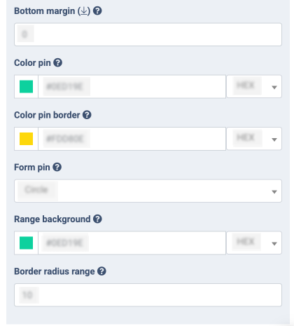
Bottom margin: Select the value to set the margin at the bottom of the label.
-
Color pin: Select the color for the pin.
-
Color pin border: Select the color for the pin border.
-
Form pin: Select the form pin (Circle, Square).
-
Range background: Select the background color for the range.
-
Border radius range: Select the border radius range.
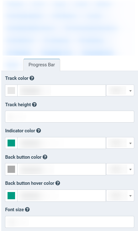
Progress Bar
-
Track color: Select the color of the track.
-
Track height: Select the height of the track.
-
Indicator color: Select the color of the indicator.
-
Back button color: Select the color of the back button.
-
Back button hover color: Select the color of the back button when hovered over.
-
Font size: Select the font size of the back button and the percentage text.
-
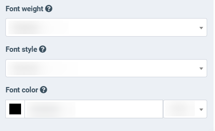
Font weight: Select the weight of the back button and the percentage text (Light, Bold, Regular) from the drop-down list.
-
Font style: Select the font style of the back button and the percentage text (Italic, Normal) from the drop-down list.
-
Font color: Select the color of the percentage text.
Error Messages
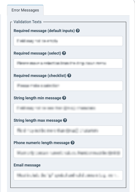
The “Validation Texts” block contains the settings for the validation, warning or error messages that will be applied to all form fields depengind on the data input type. These messages will be displayed below the input field in the form when the user enters invalid or insufficient data according to the allowed input data type or form validation. The following settings are available:
- Required message (default inputs): Enter the message that will be displayed for the fields where the input is required, except for fields with the select and checklist input types.
- Required message (select): Enter the message that will be displayed for the required fields for the select input type.
- Required message (checklist): Enter the message that will be displayed for the required fields for the checklist input type.
- Date range message: Enter the message that will be displayed when the invalid date range is selected. The placeholders and are available.
- String length min message: Enter the message that will be displayed when the minimum length of the input string is not reached. The placeholder is available.
- String length max message: Enter the message that will be displayed when the maximum length of the input string is reached. The placeholder is available.
- Phone numeric length message: Enter the validation message for the phone number data input. The message contains the phone number data type validation and the input value length. The placeholders and are available.
- Email message: Enter the validation message for the email address data input. The message contains the email address data type validation and the input value length.
Note: The list of the validation messages depends on the validation applied on the Product Settings level and may vary depending on the particular Product.
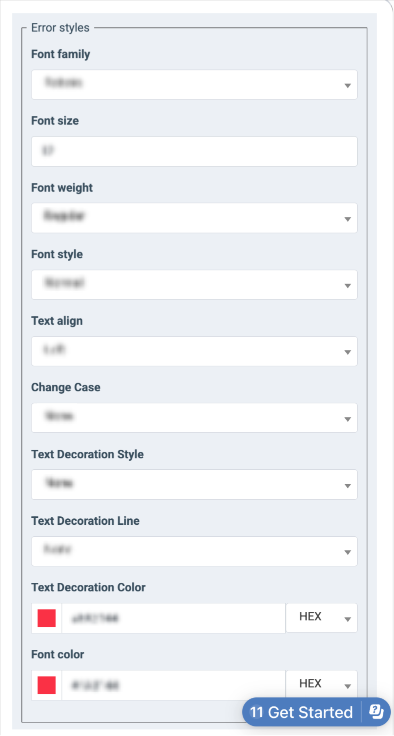
The “Error styles” block contains the settings for the validation, warning, or error message appearance customization. These settings will be applied to the messages that are set in the “Validation Texts” block. The following settings are available.
- Font family: Select the font family for the error message.
- Font size: Select the font size for the error message.
- Font weight: Select the font weight for the error message (Regular, Bold, Light).
- Font style: Select the font style for the error message (Normal, Italic).
- Text align: Select the text location for the error message (Left, Center, Right).
- Change Case: Select the change case for the error message (None, Lowercase, Uppercase).
- Text Decoration Style: Select the text style (None, Solid, Dashed, Dotted, Double, Wavy).
- Text Decoration Line: Select the text decoration style (None, Underline, Overline, Line Through).
- Text Decoration Color: Set the text decoration color.
- Font color: Set the font color.
All template changes will be shown in the form only after saving the template by clicking the “Save” button. When the template is created, customized, and has the “Active” status, it will be available while creating the form for the existing product.
To edit the template setting or activate the template, click the “Edit” button in the “Actions” column and configure the following fields in the pop-up window:
- Product: The name of the product.
-
Name: Enter the name of the template.
-
Description: Fill in the “Description” field if you need to add additional information.
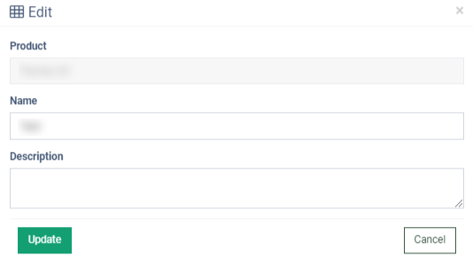
Click the “Update” button to save changes.
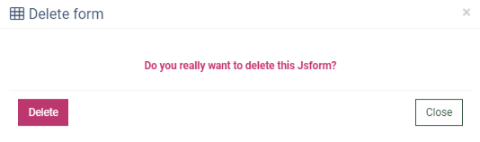
To delete the template, click the “Delete” button in the “Actions” column and confirm in the pop-up window.